Beautify Your Interior Color Schemes With The Color Wheel
Updated Fri, Jul 18, 2025 - 4 min read
Top blog articles
Interior color schemes are an important aspect when you consider designing your home. Why? The answer is obvious, isn’t it? Soothing hues, accent colors, or even dark colors simulate the mood and enhance the quality of your space — depending obviously on the existing layout. Not only this, but they also provide the perfect way for you to put your own unique seal on your home.
So, how do designers go about selecting and combining paint colors to create harmonious palettes? Well, by means of the color wheel. This is indeed one of the most important elements of interior design — for any space — such as large, medium, or small rooms. Therefore, today, we will highlight some top tricks of the trade that will help you work the color wheel, choose colors, and add vibrancy to your interiors.
Use the Color Wheel for Interior Color Schemes
An important tool for interior designers and decorators is the color wheel. Now, what is it? It is a circular diagram consisting of the primary colors (red, blue, and yellow), the secondary colors (green, purple, and orange), and the tertiary colors (red-orange, yellow-orange, yellow-green, blue-green, blue-purple, and red-purple) arranged in a specific order.
The key to using the wheel is to know how to choose palettes according to the position of the colors. The famous French-Russian artist Marc Chagall had the perfect analogy for these positions: “All colors are the friends of their neighbors and the lovers of their opposites.” Therefore, we’ll start out by looking at the “lovers” of the color wheel, which are called “complementary colors.
Read more: Bathroom colors soothe senses
The Complementary Color Palette
Complementary colors are those situated directly opposite each other on the wheel. There are three main combinations: red with green, orange with blue, and yellow with purple. These combinations go perfectly together and have an energizing effect when placed alongside each other. Hence, you can choose these interior color schemes to create bold, vibrant interiors. For example, this room uses the yellow/purple combo to spice things up:
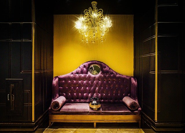
Pixabay
The Harmonious Color Palette
Want to create more of a harmonious, relaxed interior? Well, you can achieve this look by using the “friends” of the color wheel. As the name suggests, these colors sit directly next to each other.
Next, let’s take the example of an idea for warm and unified bedroom interior color schemes. You can go for a combination of, say, cinnamons, terracottas, and warm beiges to lend a cohesive effect. These shades can be found grouped together in the red and orange segments of the wheel.
Read more: Feng shui kitchen colors
The Tonal Color Palette
There’s one more palette left to consider, which we’ll call the tonal or “loner” palette. This type of interior palette is created by selecting just one color (or segment of the wheel) and using all the tones of that color. However, this sounds a little dull, doesn’t it? But, no. In fact, this type of interior color schemes palette can actually look fabulous and sophisticated. Just play with different amounts of each tone and add a lot of texture and pattern. So, in order to give a physical view, here’s a chic example that uses blues.
Read more: Simple guide to made a Feng Shui house or apartment
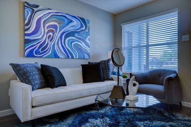
Pixabay
If you want to explore the effect of color-combinations further, below is an infographic for your quick reference.
MORE: How Colors Affect Your Mood. Infographic.
Have you tried the color wheel for any of your interior color schemes yet? If not, do give it a try and we promise, the results will be spectacular!
Written by Lucy Attwood. June 5, 2015
Lucy is an interior design advisor at KUKUN with over a decade's experience working in the profession in London, Sydney, and Buenos Aires. She's passionate about transforming spaces, sustainable design, and working with clients to create beautiful, unique homes.
Top blog posts


See more >
Recommended
Join our newsletter
Get helpful renovation tips, insightful home maintenance articles, real estate market trends, and more.
Please enter a name
Please enter a valid e-mail