Best Colors for Real Estate: The Complete Guide to Marketing, Branding & Home Staging [2026]
Updated Fri, Feb 27, 2026 - 14 min read
Top blog articles
Real Estate Color Quick Reference
Top Real Estate Marketing Colors:
- Blue: #1 choice for trust and professionalism (used by 67% of industry leaders)
- Green: Growth, stability, and nature connection (26% of real estate logos)
- Neutral tones: Timeless versatility and broad appeal
- Red: Energy and urgency (29% of industry leaders use red accents)
2026 Home Staging Colors:
- Soft whites & warm neutrals add the most value (85% of experts agree)
- Olive green kitchens can boost sale price by $1,597 on average
- Navy blue bedrooms are trending with modern buyers
- Earthy browns perfect for bathrooms (+$681 average value boost)
Why Color Choice Matters in Real Estate
In the competitive real estate industry, every detail influences success – and color psychology plays a crucial role in attracting buyers, building agent credibility, and maximizing property values. Colors are not just about aesthetics; they evoke emotions, create associations, and can even affect decision-making.
Whether you’re a real estate agent developing your brand identity, a homeowner preparing to sell, or a stager creating buyer-friendly environments, understanding color psychology and current trends is essential for success in 2026.
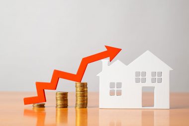
The Financial Impact of Color Choices:
- Staged homes with strategic color use sell 73% faster than unstaged properties
- Specific paint colors can add $600-$1,600 to your home’s sale price
- The right brand colors increase agent recognition and trust by up to 80%
This comprehensive guide covers everything you need to know about using color strategically in real estate – from agent branding to home staging and marketing materials.
Part 1: Best Colors for Real Estate Agent Branding & Marketing
The Psychology Behind Real Estate Brand Colors
Understanding the psychological effects of color can help you select the right palette that resonates with your target audience and strengthens your brand identity. Real estate transactions involve major life decisions, making trust and credibility paramount.
The Science Behind Color Psychology: Research published in the Journal of Experimental Psychology by the American Psychological Association demonstrates that colors significantly impact human psychological functioning, affecting cognition, emotion, and behavior. A comprehensive 128-year systematic review of color-emotion research found consistent patterns across cultures, with specific colors reliably triggering emotional responses that influence decision-making processes.
Top Real Estate Brand Colors and Their Impact
1. Blue: The Industry Standard for Trust
Over two-thirds of industry-leading logos feature blue, with the color being requested in over 50% of real estate logo design contests.
Why Blue Works for Real Estate:
- Trust and reliability: Essential for major financial decisions
- Professionalism: Conveys expertise and competence
- Stability: Suggests long-term partnership
- Versatility: Works across digital and print materials
The Research Behind Blue’s Effectiveness: Marketing psychology studies show that color increases brand recognition by up to 80%, with initial impressions being 62-90% based on color alone. Blue specifically has been shown to enhance trust ratings significantly in consumer psychology research, making it particularly valuable for high-stakes financial decisions like real estate transactions.
Blue Variations and Their Messages:
- Navy Blue: Authority and sophistication (Coldwell Banker approach)
- Light Blue: Approachable and calming (Prudential style)
- Royal Blue: Confidence and premium service
Best Use Cases: Primary brand color, website headers, business cards, signage
2. Green: Growth and Prosperity
Green appears in roughly 26% of real estate logo design contests and conveys natural growth and prosperity.
Green’s Real Estate Advantages:
- Growth symbolism: Perfect for investment-focused agents
- Nature connection: Appeals to suburban and eco-conscious buyers
- Prosperity association: Links to financial success
- Calming effect: Reduces stress in high-stakes transactions
Strategic Applications:
- Agents specializing in rural or suburban properties
- Investment property specialists
- Eco-friendly and sustainable housing advocates
- New construction and development marketing
3. Red: Energy and Urgency
Red appears in roughly a third (about 29%) of real estate industry leaders’ logos.
When Red Works Best:
- Call-to-action elements: “Contact now” buttons, sale signs
- Accent color: Paired with neutral or blue primary colors
- Limited-time offers: Creates appropriate urgency
- Competitive markets: Helps agents stand out
Red Usage Warnings:
- Can feel aggressive if overused
- May not appeal to risk-averse buyers
- Consider cultural associations in diverse markets
4. Neutral Colors: Timeless Sophistication
The Power of Neutral Branding:
- Gray: Modern, sophisticated, professional
- Black: Luxury, elegance, premium service
- Beige/Tan: Approachable, reliable, stable
Gray, black and white are also popular as easy companions to any color.
Color Combinations That Work
Proven Real Estate Color Palettes:
- Classic Professional: Navy blue + crisp white + silver accents
- Modern Approachable: Soft blue + warm gray + white
- Luxury Focused: Black + gold + white
- Nature-Inspired: Forest green + cream + brown accents
- Energy-Forward: Red + charcoal gray + white
Colors to Avoid in Real Estate Branding
Problematic Color Choices:
- Pink: Appears in less than 2% of all real estate logos, ranking last as a color choice in the industry.
- Bright yellow: Can appear unprofessional or childish
- Purple: May seem too trendy or niche for broad market appeal
- Orange alone: Can feel too casual for serious transactions
Part 2: Home Staging Colors That Sell Properties Fast
The 2026 Home Staging Color Revolution
Gone are the days of real estate agents and home stagers telling you that your home needs to look like a completely blank slate in order to sell. Current data shows strategic color use can actually increase sale prices and buyer interest.
Research-Backed Color Impact: According to the National Association of Realtors’ 2026 Profile of Home Staging, 83% of buyers’ agents report that staging makes it easier for buyers to visualize properties as future homes. Furthermore, NAR research on leveraging color science reveals that up to 90% of homebuying decisions are influenced by color, which can have a greater impact on people’s moods and reactions than previously thought.
Room-by-Room Color Strategy
Kitchen Colors That Add Value
Olive Green: The #1 Value-Adding Kitchen Color According to Zillow’s 2026 paint color analysis, buyers will actually pay an average of $1,597 more for a home with a kitchen in the verdant hue.
Why Olive Green Works:
- Perceived as contemporary and fresh
- Creates “halo effect” on the entire home perception
- Appeals to nature-loving millennials and Gen Z buyers
- Pairs beautifully with white countertops and natural wood
Alternative Kitchen Colors:
- Soft white: Classic choice that highlights other features
- Warm gray: Modern but not too trendy
- Navy blue: Bold but sophisticated option
Bedroom Colors for Better Sales
Navy Blue: The Modern Bedroom Choice Zillow’s experts report that buyers prefer a navy blue in the bedroom, such as Naval by Sherwin-Williams or fan-favorite Hague Blue by Farrow & Ball.
Bedroom Color Strategy:
- Primary bedrooms: Navy blue or sophisticated charcoal
- Guest bedrooms: Soft neutrals or pale blue-gray
- Children’s rooms: Soft pastels like pale yellow, light green, or baby blue. These colors are calming yet cheerful.
Bathroom Colors That Boost Value
Mid-Tone Brown: The Bathroom Winner Zillow’s analysis finds that prospective buyers will pay $681 more for a house with a bathroom painted in this color.
2026 Bathroom Trends:
- Warm, earthy browns inspired by Pantone’s Mocha Mousse
- Spa-like greens for relaxation
- Classic white for timeless appeal
Living Room Color Psychology
Charcoal gray dominated, and it still remains one of homeowners’ preferred colors in the living room.
Living Room Success Colors:
- Charcoal gray: Makes large spaces feel cozy
- Warm white: Creates bright, welcoming atmosphere
- Soft beige: Universal appeal across demographics
2026 Home Staging Color Trends
Current Trending Colors
Earth tones are in for 2026, and rich, yummy browns are a favorite!
Top 2026 Staging Colors:
- Mocha Mousse (Pantone 2026 Color of the Year)
- Cinnamon Slate (Benjamin Moore 2025 Color)
- Soft whites and warm neutrals
- Earthy greens and muted blues
- Terracotta and warm clay tones
Color Drenching Technique
Color drenching trended in 2025 and it isn’t going anywhere in 2026. Drenching is when walls, trim, and sometimes ceilings are painted in a single hue.
How to Use Color Drenching in Staging:
- Choose sophisticated, muted colors
- Apply to accent walls rather than entire rooms
- Use in powder rooms or home offices for impact
- Balance with neutral furnishings
Colors to Avoid When Staging
Colors That Turn Off Buyers
Red is the most off-putting color, according to a National Association of Realtors survey of home staging professionals.
Colors That Turn Off Buyers:
- Red: Too aggressive and personal
- Bright yellow: Can feel overwhelming
- Dark purple: Too bold and niche
- Hot pink: Limited appeal
- Bright orange: May feel dated
The Science Behind Color Avoidance: Research from Frontiers in Psychology on color-emotion processing shows that red can trigger stress responses and feelings of aggression, which may explain why it’s problematic in home staging contexts where buyers need to feel comfortable and relaxed.
Part 3: Real Estate Marketing Materials Color Guide
Website and Digital Marketing Colors
Best Colors for Real Estate Websites
Blue can make people feel secure and trustworthy, while orange can evoke energy and enthusiasm.
Digital Color Strategy:
- Primary navigation: Blue or navy for trust
- Call-to-action buttons: Contrasting colors like orange or green
- Background: Clean whites or light neutrals
- Text: Dark charcoal for readability
Social Media Branding Colors
Platform-Specific Considerations:
- Instagram: Cohesive feed with 2-3 brand colors maximum
- Facebook: Professional blues and neutrals perform best
- LinkedIn: Conservative colors convey professionalism
- TikTok: Can handle more vibrant, energetic colors
Print Marketing Color Psychology
Brochure and Flyer Colors
Blue is often regarded as one of the best colours for real estate, offering a sense of comfort to the viewer.
Print Material Best Practices:
- Property brochures: Use property-complementary colors
- Agent business cards: Stick to brand colors consistently
- Yard signs: High-contrast combinations for visibility
- Direct mail: Test different colors for response rates
Signage Color Strategy
For Sale Sign Optimization:
- Traditional: Blue and white for trust
- Premium properties: Black and gold for luxury
- Quick sales: Red accents for urgency (use sparingly)
- New construction: Green suggests growth and potential
Part 4: Advanced Color Psychology in Real Estate
Cultural Considerations in Color Choice
Understanding Your Market Demographics
Generational Color Preferences:
- Baby Boomers: Traditional blues, greens, and neutrals
- Gen X: Sophisticated grays and earth tones
- Millennials: Warmer whites and nature-inspired colors
- Gen Z: Bold accent colors with neutral bases
Cultural Color Sensitivity:
- Research local color associations
- Consider religious and cultural symbolism
- Adapt materials for diverse communities
Seasonal Color Adaptations
Spring Real Estate Colors
- Fresh greens and soft blues
- Light, airy whites and creams
- Pastel accents for warmth
Summer Marketing Colors
- Bold blues and cooling greens
- Bright whites for heat reflection
- Ocean-inspired palettes
Fall Home Staging
- Earthy greens are experts’ top recommended colors for fall selling
- Warm browns and terracotta tones
- Cozy neutrals with texture
Winter Property Colors
- Rich, deep blues for sophistication
- Warm whites and creams for comfort
- Metallic accents for luxury feel
Part 5: Implementing Your Real Estate Color Strategy
Creating a Cohesive Brand Color Palette
Step 1: Define Your Brand Personality
As a real estate agent, you might describe your brand personality as both competent and sophisticated, or sincere and excited.
Brand Personality Questions:
- What type of properties do I specialize in?
- Who is my ideal client demographic?
- What market position do I want to occupy?
- How do I want clients to feel when working with me?
Step 2: Select Your Primary Color
Primary Color Selection Criteria:
- Aligns with brand personality
- Appeals to target demographic
- Works across all marketing materials
- Differentiates from local competitors
Step 3: Build Your Supporting Palette
Complete Palette Structure:
- Primary color: 60% of brand usage
- Secondary color: 30% for balance and variety
- Accent color: 10% for highlights and calls-to-action
- Neutral base: For backgrounds and text
Testing and Measuring Color Effectiveness
A/B Testing Color Strategies
Test Elements:
- Website button colors for conversion rates
- Email marketing color schemes for open rates
- Social media post colors for engagement
- Print advertising color combinations for response
Scientific Approach to Color Testing: The Institute for Color Research methodology suggests that people make subconscious judgments within 90 seconds, with 62-90% of that assessment based on color alone. This rapid decision-making process makes A/B testing crucial for optimizing color choices in real estate marketing materials.
Key Performance Indicators
Metrics to Track:
- Lead generation from different colored materials
- Time on site for various color schemes
- Social media engagement by color palette
- Client feedback on brand perception
Budget-Friendly Color Implementation
Affordable Color Updates
Low-Cost, High-Impact Changes:
- Update digital materials first (immediate implementation)
- Refresh print materials gradually as supplies run out
- Add colorful accessories to staged homes
- Use color strategically in accent areas
DIY Color Resources:
- Free online color palette generators
- Brand guideline templates
- Social media design tools
- Home staging color apps
Part 6: 2026 Real Estate Color Trends and Predictions
Emerging Color Trends
Biophilic Design Colors
Biophilic design, a move towards curves, and more multi-functional spaces are expected to be the design highlights of 2026.
Nature-Inspired Palettes:
- Forest and sage greens
- Sky and ocean blues
- Stone and earth neutrals
- Sunset warm accents
Read more: Biophilic upgrades are adding home values
Sustainable Color Choices
Eco-Conscious Color Trends:
- Low-VOC paint emphasis
- Natural, unprocessed color tones
- Recycled and upcycled color materials
- Locally-sourced color inspirations
Technology and Color Innovation
AI-Powered Color Selection
Emerging Technologies:
- Color analysis apps for property staging
- AI-generated brand palette suggestions
- Virtual staging with customizable colors
- Augmented reality color visualization
Digital Color Optimization
Screen vs. Print Considerations:
- Color calibration across devices
- Accessibility compliance for color contrast
- Mobile-optimized color schemes
- Print color accuracy maintenance
Working with Design Professionals
When to Hire Color Experts
Consider Professional Help For:
- Complete brand development
- High-end property staging
- Large-scale marketing campaigns
- Market repositioning efforts
Types of Color Professionals:
- Brand designers for agent marketing
- Interior designers for luxury staging
- Web designers for digital presence
- Marketing consultants for comprehensive strategy
Cost-Effective Color Consulting
Budget-Friendly Expert Options:
- Online color consultation services
- Template-based brand packages
- Group coaching programs
- Educational webinars and courses
Related Resources and Internal Guidance
For additional insights on maximizing your real estate success, explore these complementary topics:
- Amazing Ways to Make Your Home Smart – Modern technology features that complement contemporary color schemes
- Kids’ Bedroom Interior Design – Specialized color strategies for family-focused staging
- Emergency Home Maintenance – Maintain your color investments with proper home care
- TLC Meaning in Real Estate – How color updates can transform TLC properties
Conclusion: Mastering Color for Real Estate Success
Color psychology in real estate extends far beyond personal preference – it’s a strategic tool that influences buyer behavior, builds agent credibility, and maximizes property values. The key insights for 2026 success include:
For Real Estate Agents:
- Blue remains the most trusted brand color, but don’t overlook green for differentiation
- Consistency across all marketing materials builds recognition and trust
- Test different color combinations to optimize lead generation
For Home Sellers and Stagers:
- Soft, warm whites, warm neutrals, off-whites, and earthy greens are experts’ top recommended colors
- Strategic color use can add hundreds to thousands to your sale price
- Current trends favor warmer, more personality-driven colors over stark minimalism
For 2026 and Beyond:
- Earth tones and nature-inspired colors continue gaining popularity
- Technology will increasingly help with color selection and visualization
- Sustainable and wellness-focused color choices align with buyer values
Action Steps:
- Audit your current color strategy across all materials and properties
- Test new approaches with small-scale implementations first
- Stay informed about emerging trends while maintaining brand consistency
- Measure results to optimize your color choices over time
The real estate market continues evolving, but the psychological power of color remains constant. By understanding these principles and applying them strategically, you can create more effective marketing, stage more appealing properties, and build a stronger brand presence in your market.
Whether you’re painting a kitchen olive green to add $1,597 to the sale price or choosing the perfect blue for your agent logo, remember that every color decision is an opportunity to influence perception, build trust, and achieve better results in your real estate endeavors.
Frequently Asked Questions
Q: What is the most effective color for real estate agent branding? A: Blue is the industry standard, used by 67% of leading real estate companies because it conveys trust and professionalism. However, green (26% usage) can help agents stand out while maintaining positive associations.
Q: Do colored walls really affect home sale prices?
A: Yes, according to 2025 Zillow data, specific colors can add significant value – olive green kitchens average $1,597 more, while mid-tone brown bathrooms add about $681 to sale prices. This aligns with National Association of Realtors research showing that 29% of agents report staging increases home values by 1-10%.
Q: What colors should I avoid when staging a home? A: Red is the most off-putting color to buyers, followed by bright yellow, dark purple, and hot pink. These colors are too personal and may alienate potential buyers.
Q: How often should real estate agents update their brand colors? A: Maintain consistency for brand recognition, but consider refreshing accent colors every 3-5 years or when significant market shifts occur. Your primary brand colors should remain stable for long-term recognition.
Q: Are neutral colors still the best choice for home staging? A: While neutrals remain important for broad appeal, 2026 trends show that strategic use of sophisticated colors (like olive green or navy blue) can actually increase buyer interest and sale prices.
Last Updated: February 2026 | Sources: Zillow Paint Color Analysis 2025, National Association of Realtors, Real Estate Staging Association, Color Psychology Research
Written by Vanessa Gallanti. September 16, 2025
Enthusiast about planning, project management, construction materials and technology, and construction. A civil engineer from Los Andes University and a content writer for Kukun.
Top blog posts


See more >
Recommended
Join our newsletter
Get helpful renovation tips, insightful home maintenance articles, real estate market trends, and more.
Please enter a name
Please enter a valid e-mail